Creative lettering and beyond / Kirkendall, Gabri Joy,
A smile in the mind : witty thinking in graphic design /McAlhone, Beryl.
New masters of poster design : poster design for this century and beyond.Foster, John,
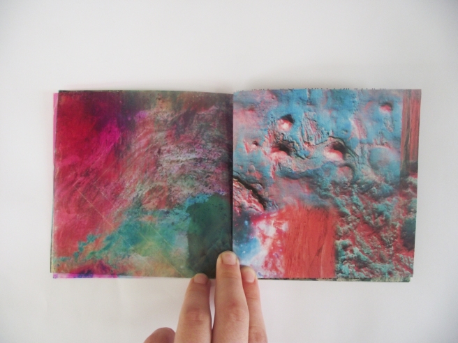
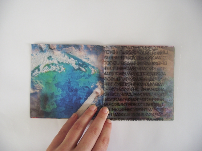
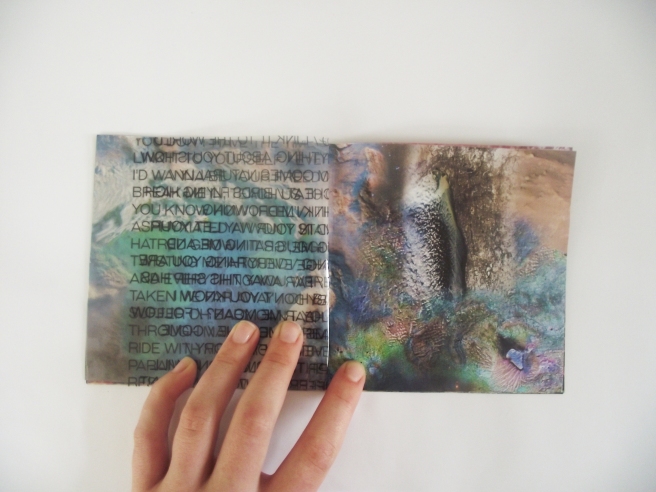
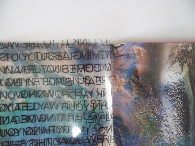
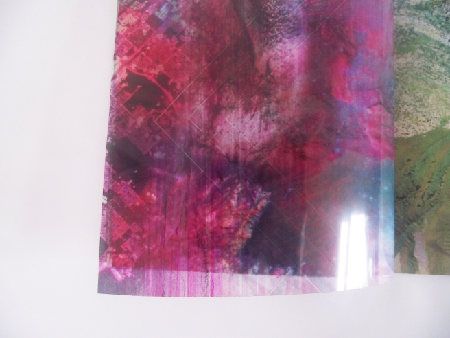
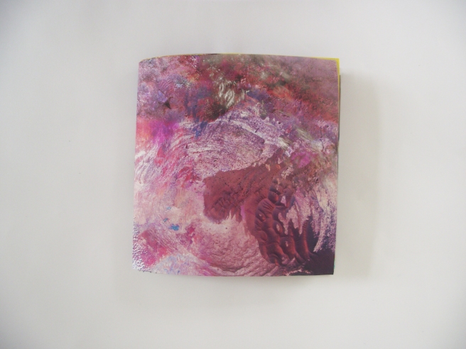
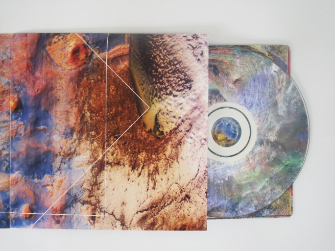
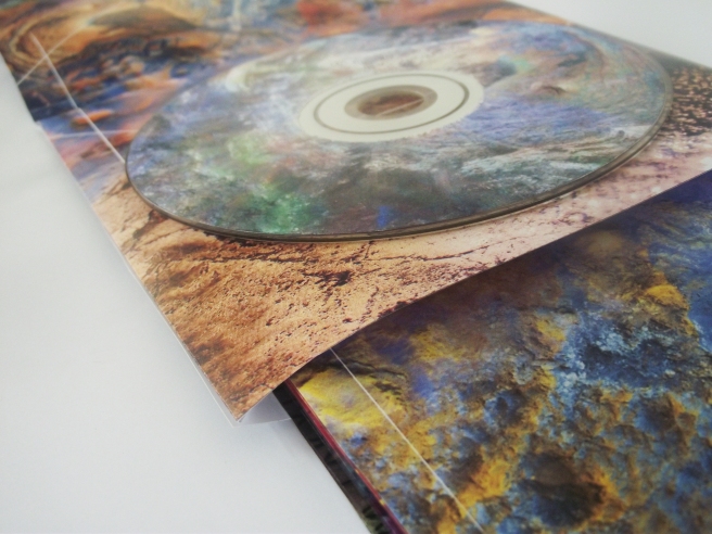
Musigraphics : a collection of LP and CD art
The birth of stars and planets / Bally, John.
London Zoo : from old photographs 1852-1914 /Edwards, John,
By underground to the zoo : London Transport posters 1913 to the present /Riddell, Jonathan.
Swiss graphic design : the origins and growth of an international style, 1920-1965 /Hollis, Richard.
I heart design : significant graphic design selected by designers, illustrators and critics /
The big book of graphic design /
Tom Eckersley : his graphic work.
New masters of poster design : poster design for the next century / Foster, John,
Reasons to be cheerful : the life and work of Barney Bubbles /Gorman, Paul.